Change is constant. And as your organization changes, it’s natural to focus on keeping up. But sometimes, the visuals are the last thing to evolve.
When your organization is doing great work, it’s important that your visuals and outreach materials always reflect the caliber of that work (because they strengthen your mission and help you engage with more supporters)!
Here are some before and afters that helped these organizations better convey their message.
The National Security Archive is a nonprofit research and archival institution who needed to brand their organization in a way that showed the importance of the work they do. Their original logo was confusing; it didn’t even say their name. Together we worked to create a strong logo and clear brand guidelines that would serve them more accurately.
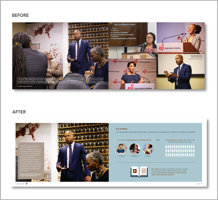
The Equal Justice Initiative is committed to ending mass incarceration and excessive punishment in the United States. I worked to redesign their Community Remembrance Brochure to highlight the four component activities of the campaign and lead to a deeper engagement while being more aesthetically pleasing. Icons, infographics and photos were added to the brochure to add visual interest and help highlight important facts.
The L.A. Opportunity Youth Collaborative (OYC) is a network of public agencies, nonprofit organizations, education systems, and employers working together to support and connect transition-age foster youth in achieving education and employment. They needed a brand that conveyed partnership, collaboration and networking. We worked together to create a logo, brand guidelines and an identity system inspired by shape-like letters that fit together—because that’s what their work is all about.
What does your before and after look like? Let’s figure it out together.


